Stichting Print
Stichting Print
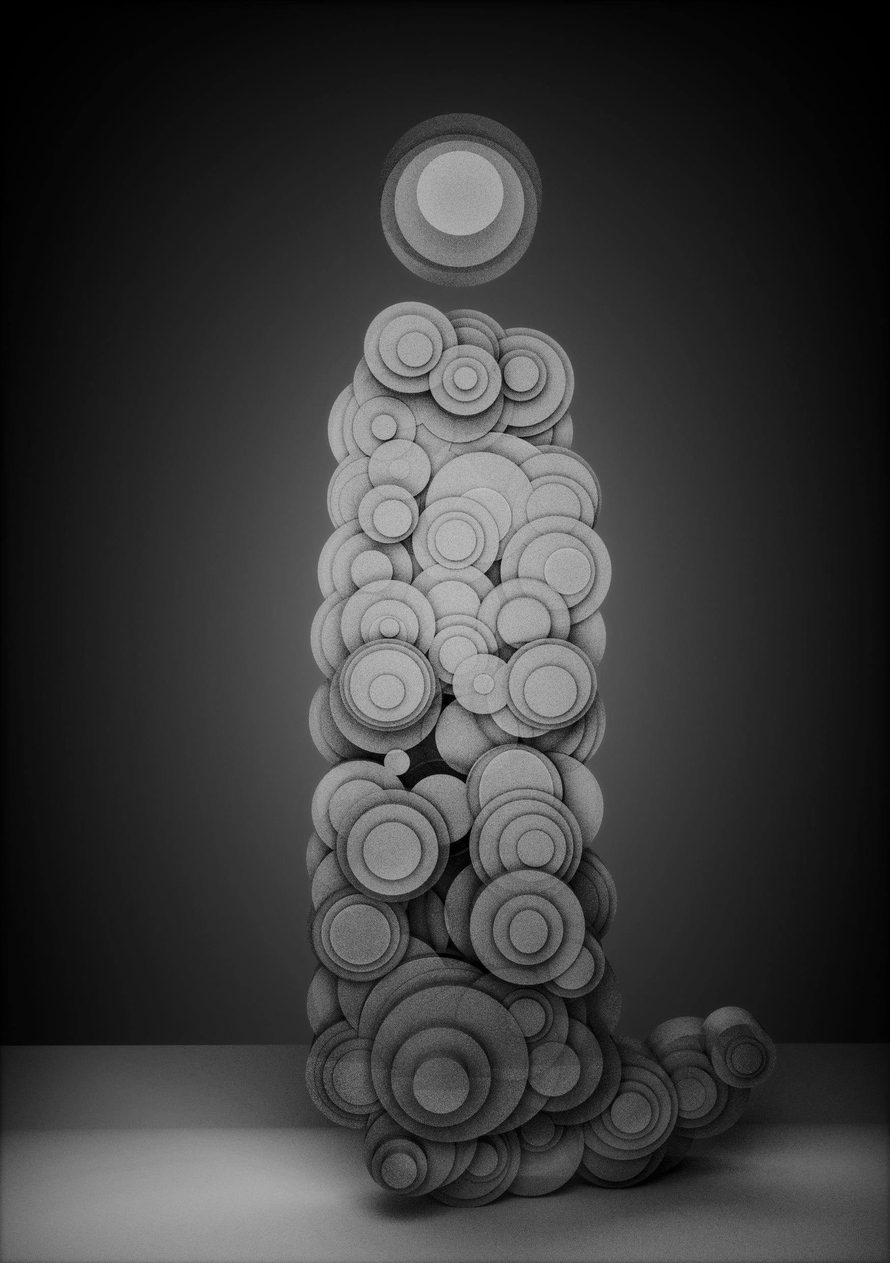
Stichting Print is a Dutch initiative launched in 2015 whose aim it is to shine a light on typographic design and graphic design. They’ve commissioned 26 artists to each illustrate one letter of the Dutch alphabet in greyscale.
For me they had the “I” in mind. A brainstorming how to present this letter ensued because for me, the “I” is definitely one of the more challenging letters in the alphabet. For me, on a conceptual and metaphysical level it alludes to all the puns in the universe you can think of when it comes to this letter. From the self, the ego and its’ selfish connotations to the concept of an eye, which sounds a lot like the letter. The idea of an eye, which is an instrument of individual perception among other things, in that sense quickly related back to the ego and the self question.
Quickly I decided that this could be less of a graphic letter and more of a 3 dimensional one, where I could play around with the space it could occupy and possibly incorporate the idea of the letter “I’ being a personality. I chose to use many semi transparent circles to evoke the idea that the self is compromised of sets of seemingly separate areas which overlap and form a complex whole. In this case it’s presented as a portrait or as a photograph of a statue. I’m not entirely sure how much personality is left of the initial concept, but in making this letter and setting up the virtual camera, the lighting and the composition, I kept in mind that it would be great to have this image be like a portrait photo of the letter itself, hopefully transcending the idea of a graphic symbol used to compose words with in writing.
2015
songs of a canary in a coal mine
songs of a canary in a coal mine
songs of a canary in a coal mine
get in touch! yorobi@gmail.com
All content subject to copyright 2022 by Yorobi/Josje Bijl
get in touch! yorobi@gmail.com
All content subject to copyright 2022 by Yorobi/Josje Bijl
get in touch! yorobi@gmail.com
All content subject to copyright 2022 by Yorobi/Josje Bijl