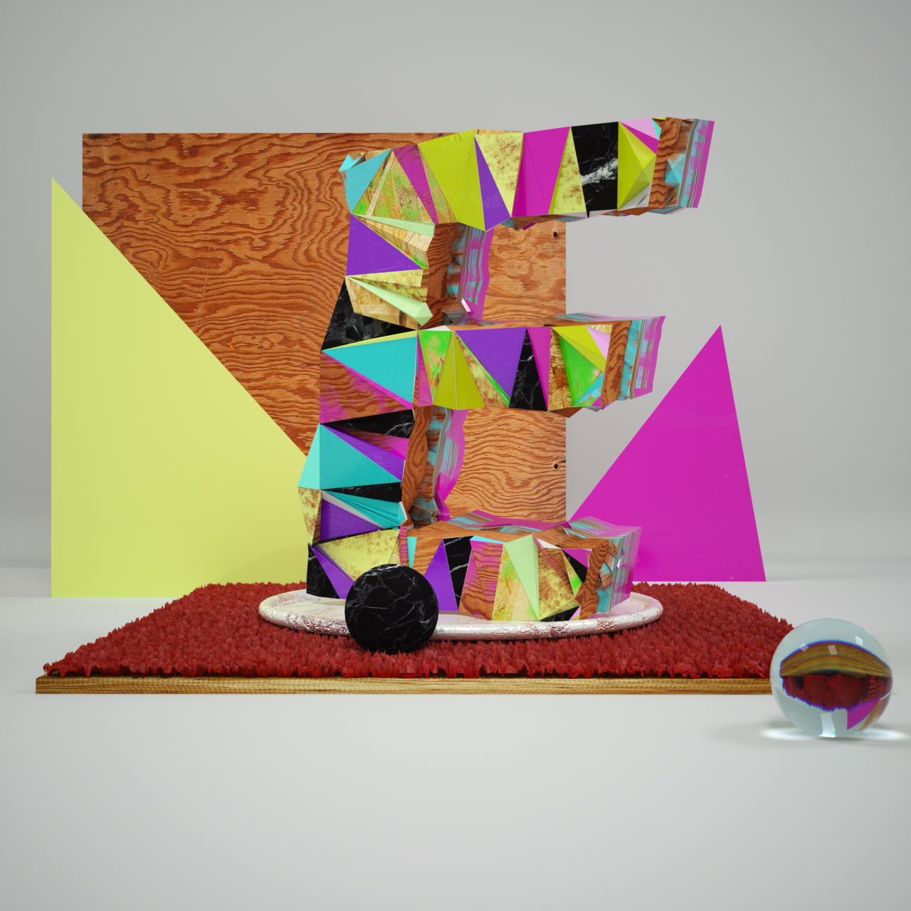
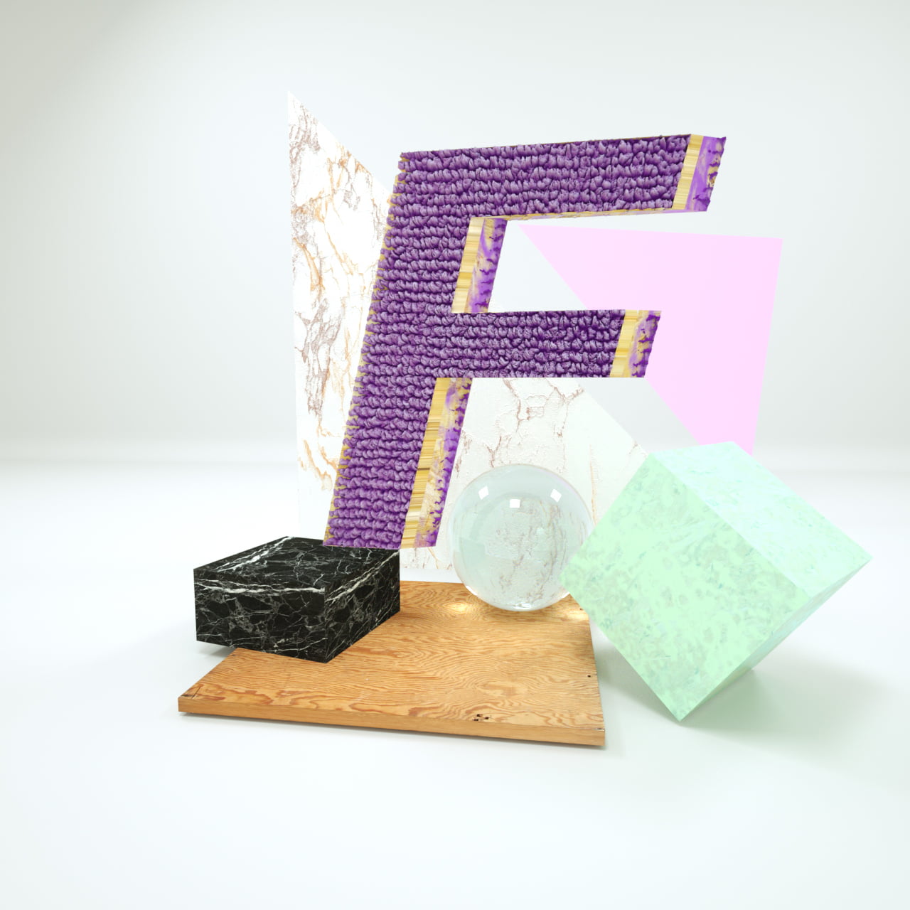
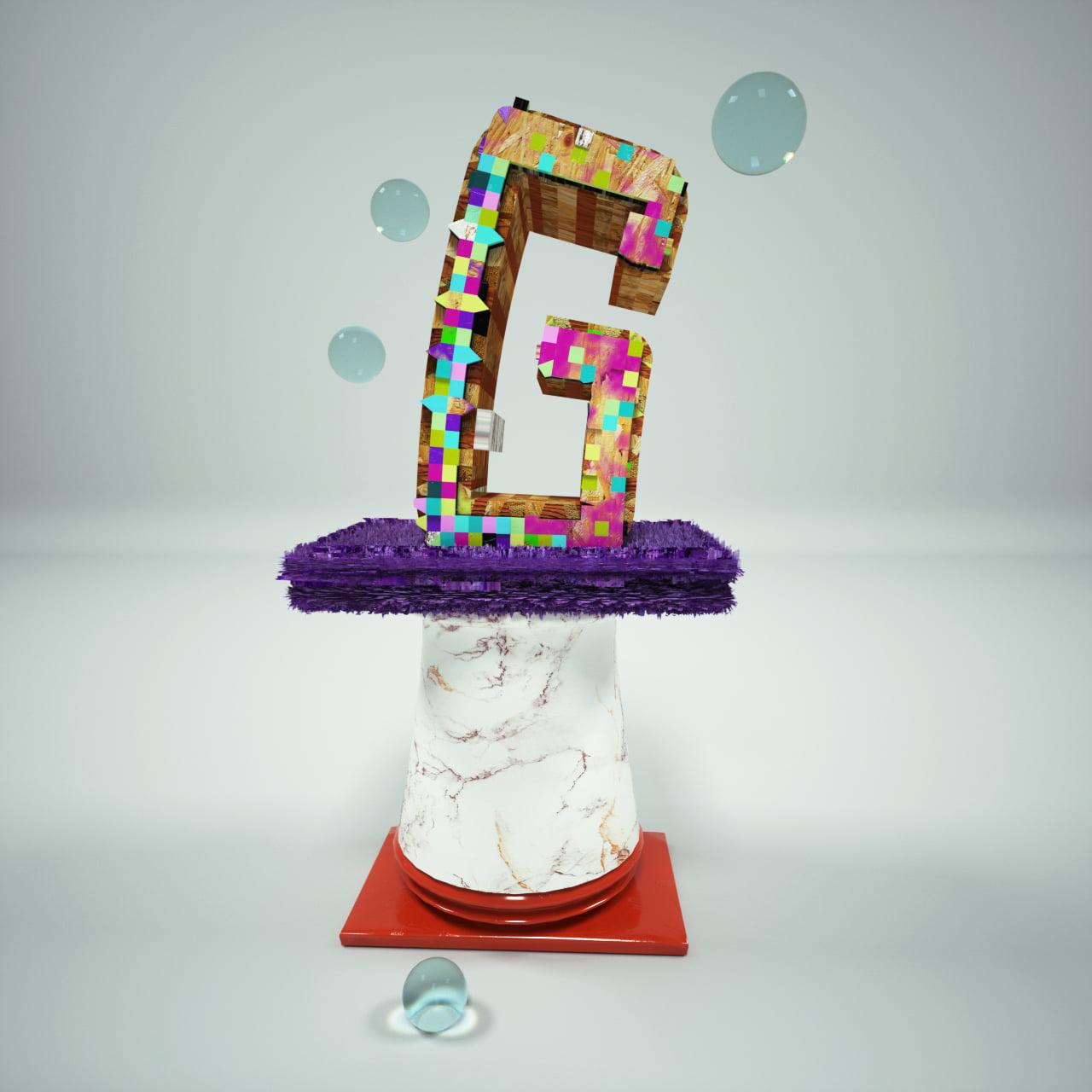
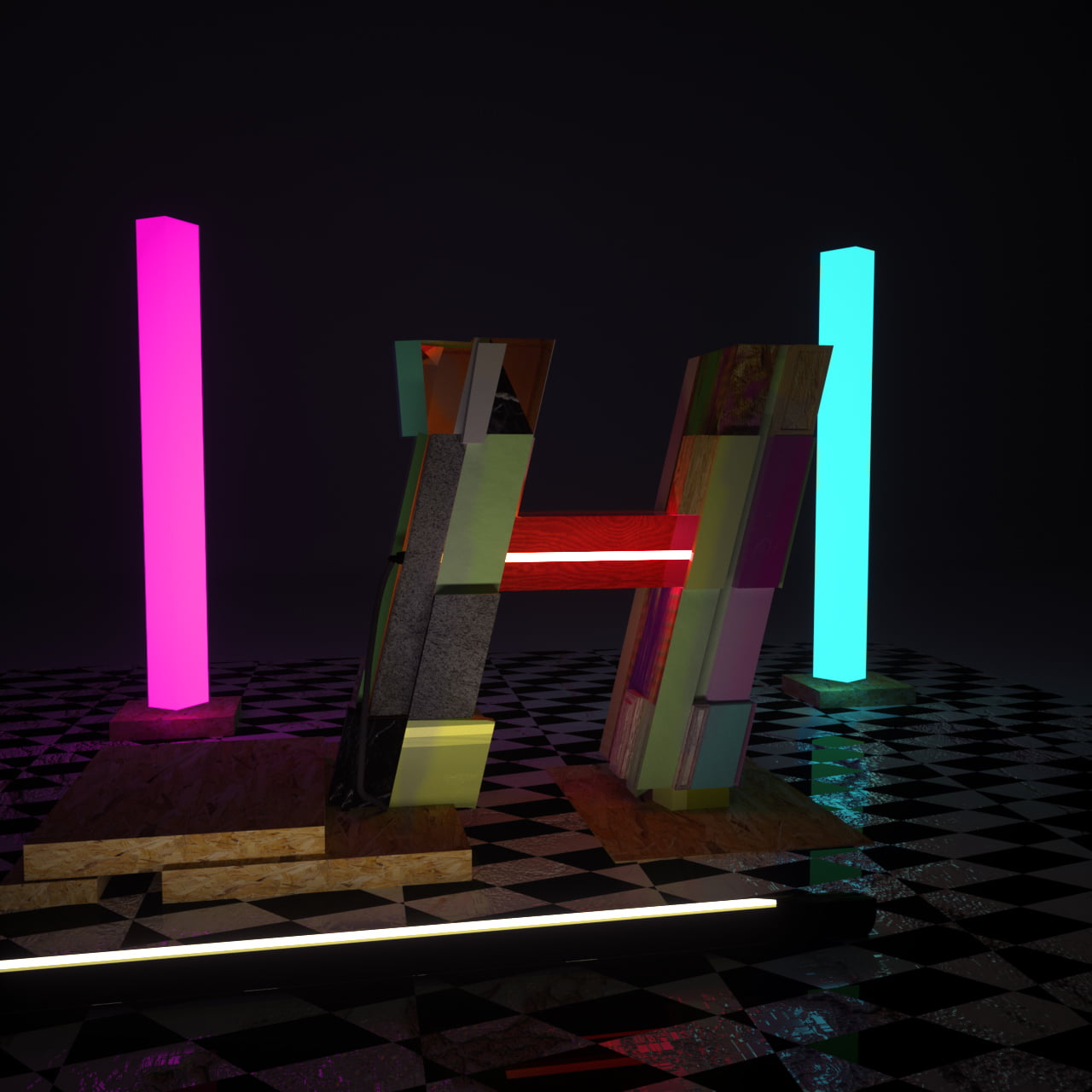
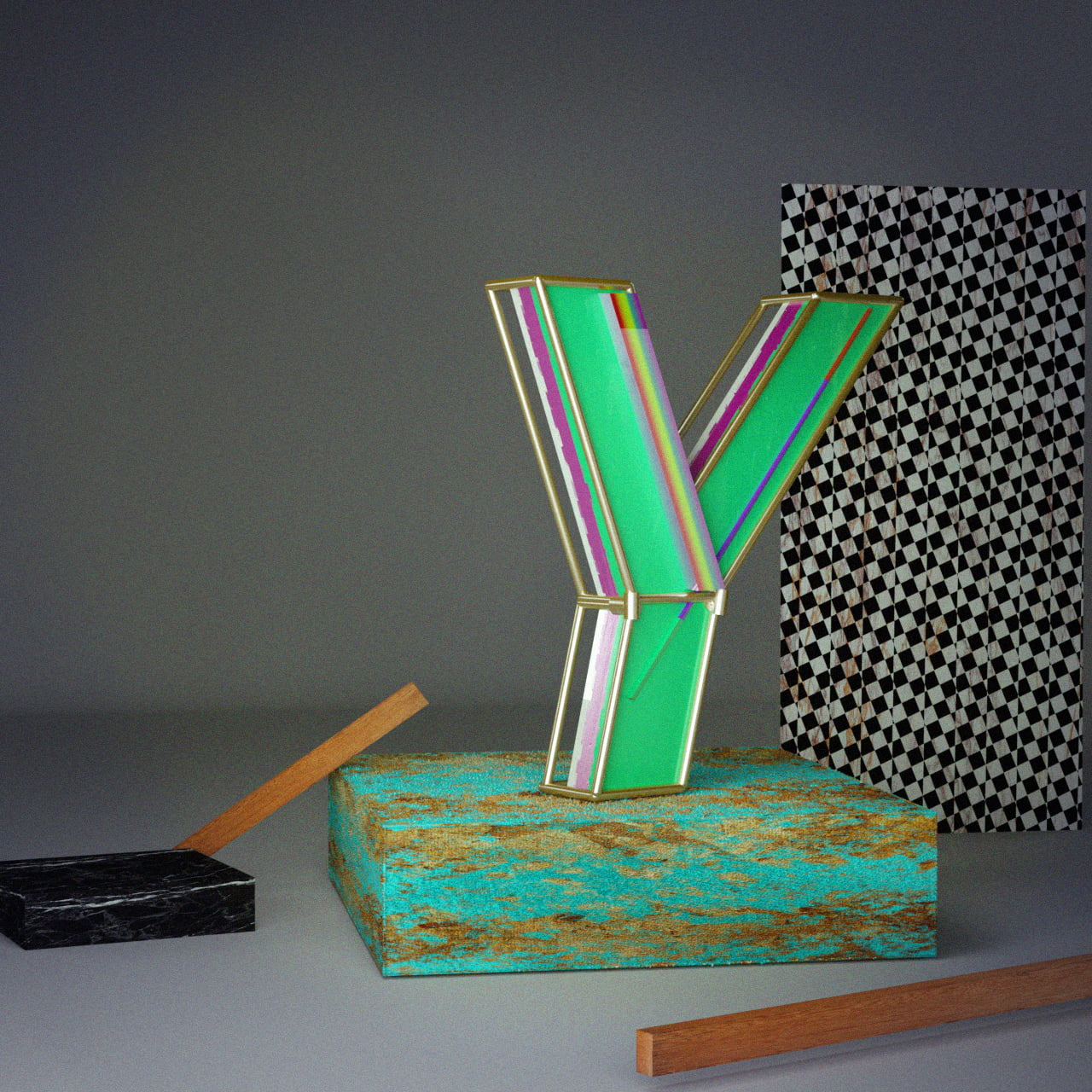
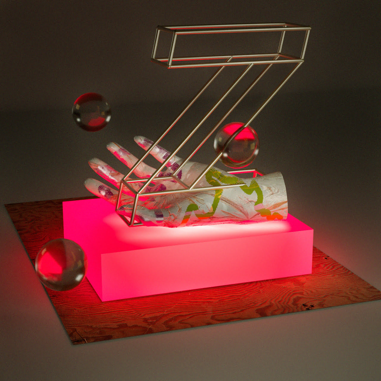
36 days of type.
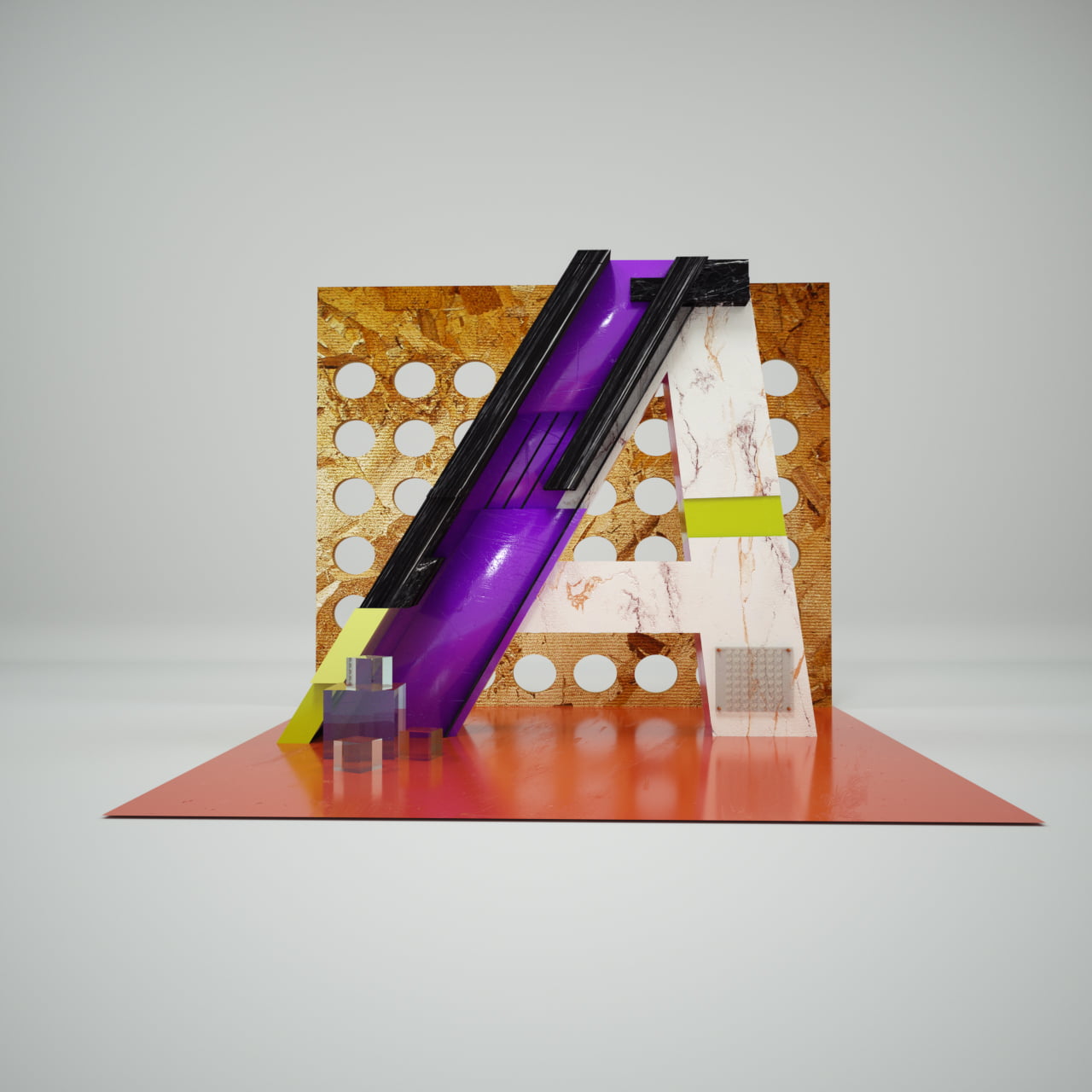
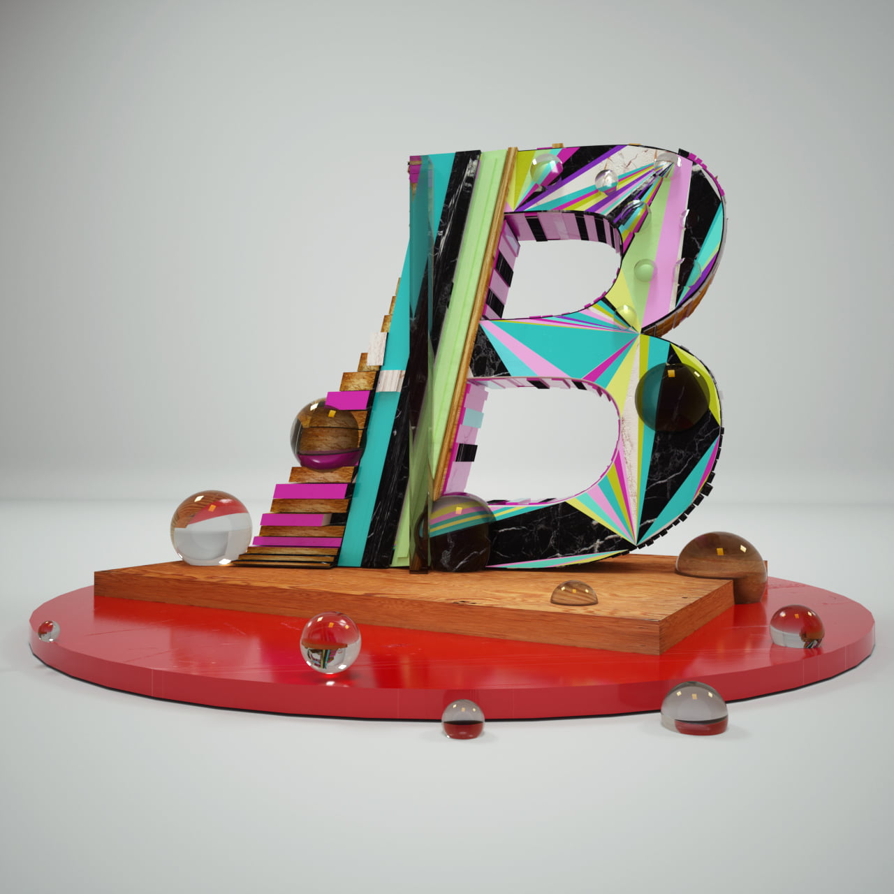
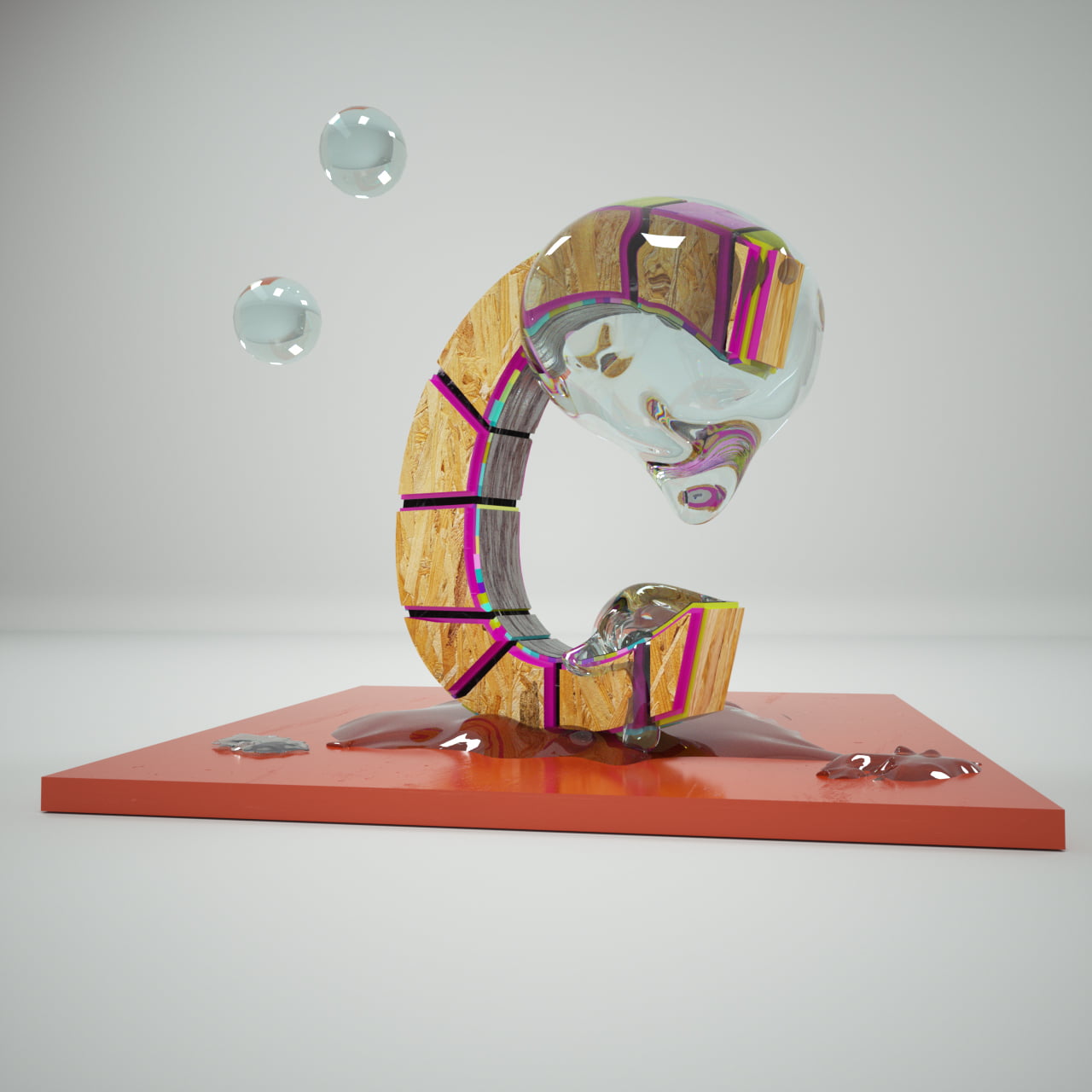
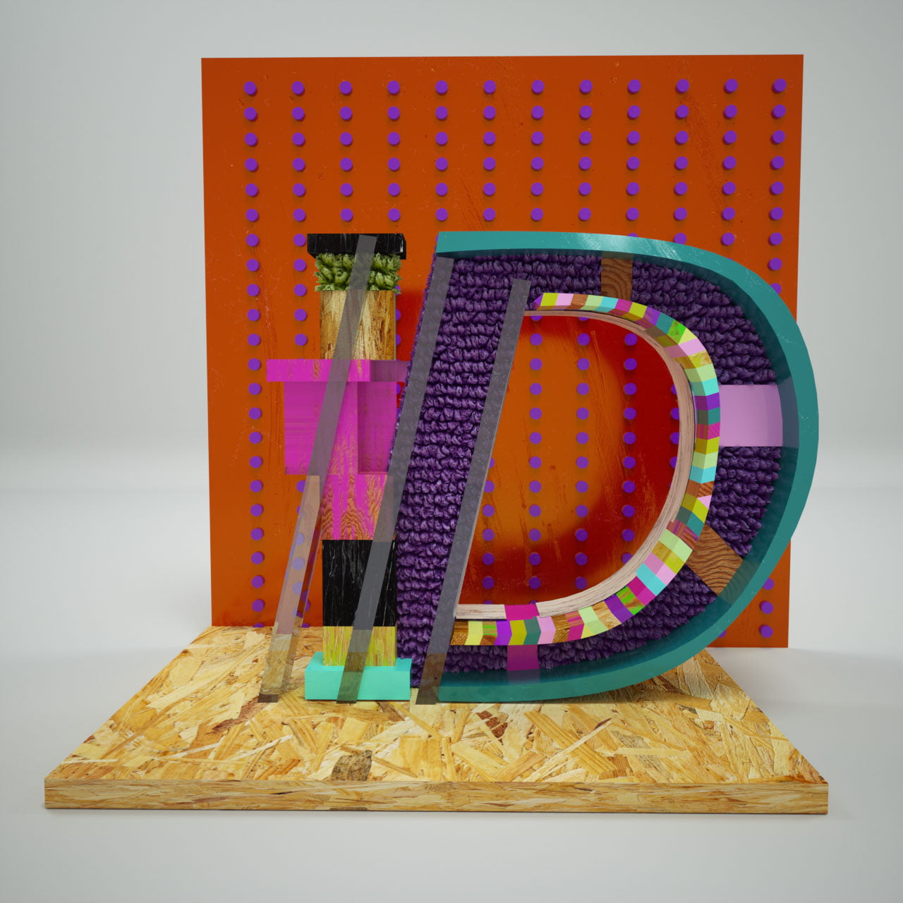
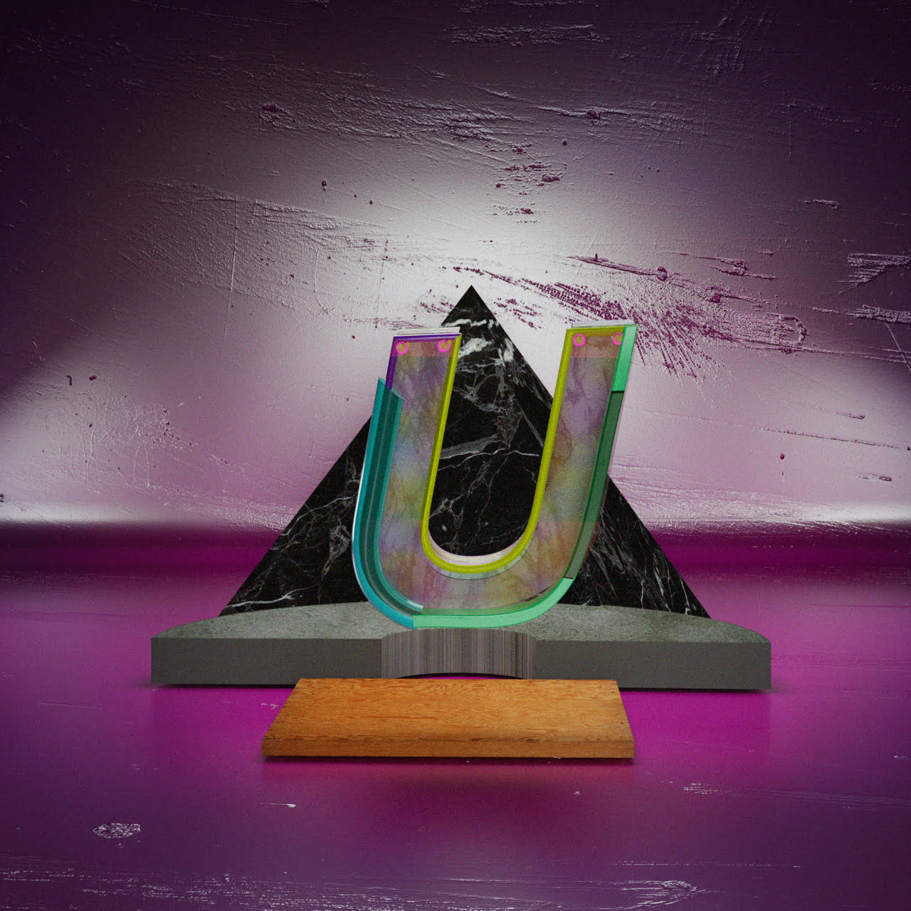
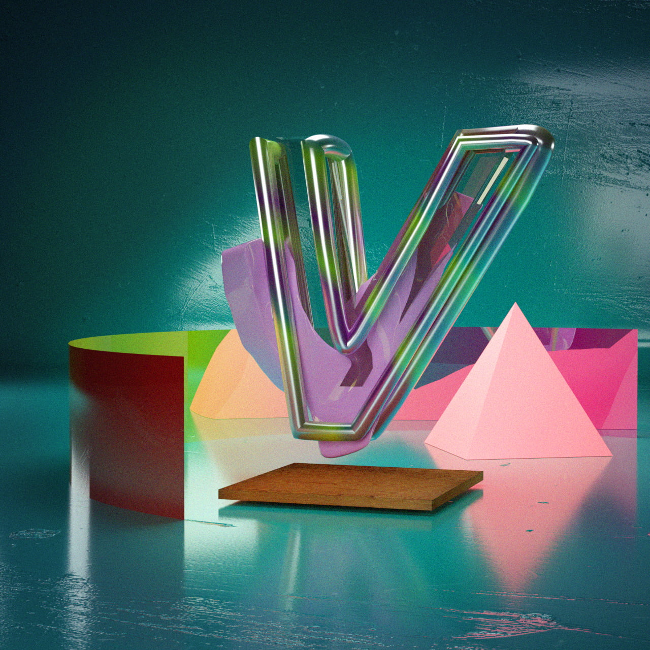
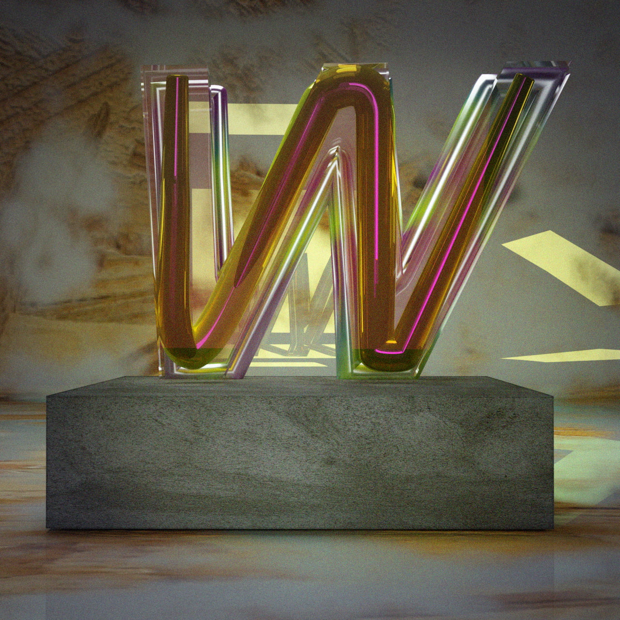
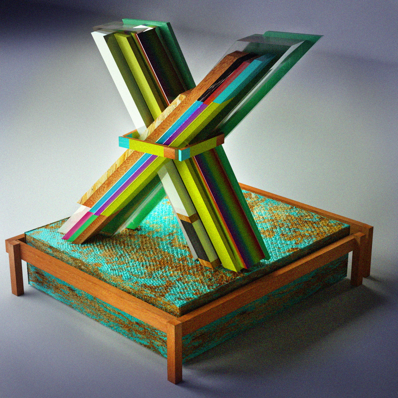
After having seen the Instagram typography challenge of 2017, where (graphic) designers from all over the internet took part in designing a letter each day I decided to take part in this wonderful project. Obviously it was a real challenge to come up with something new.
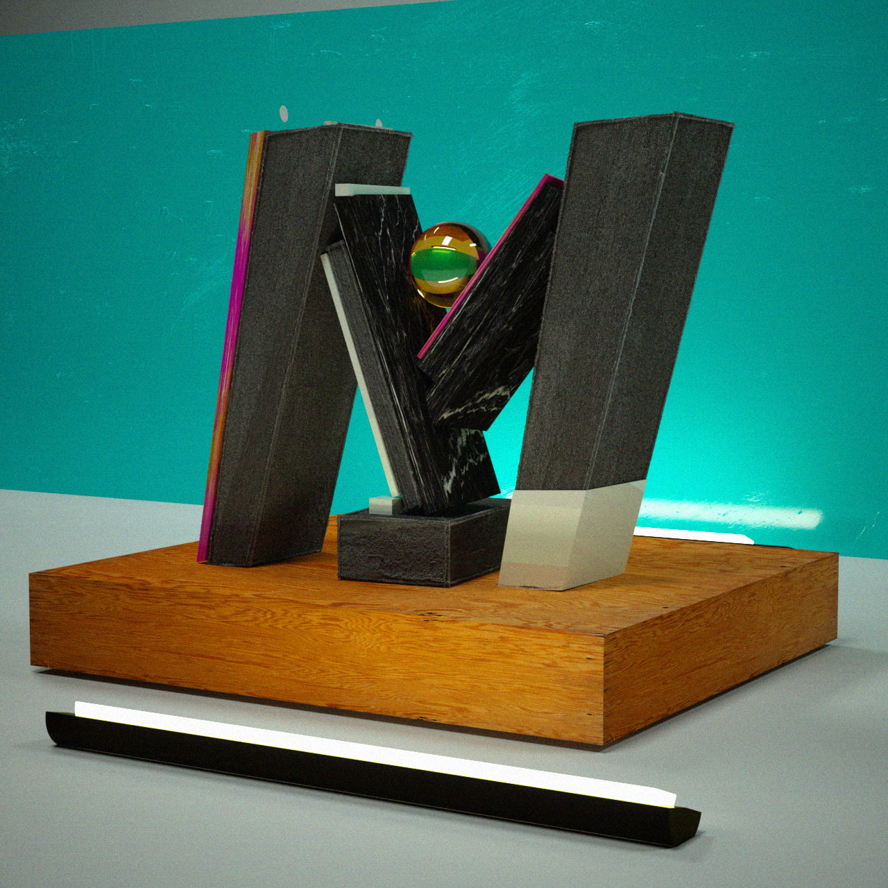
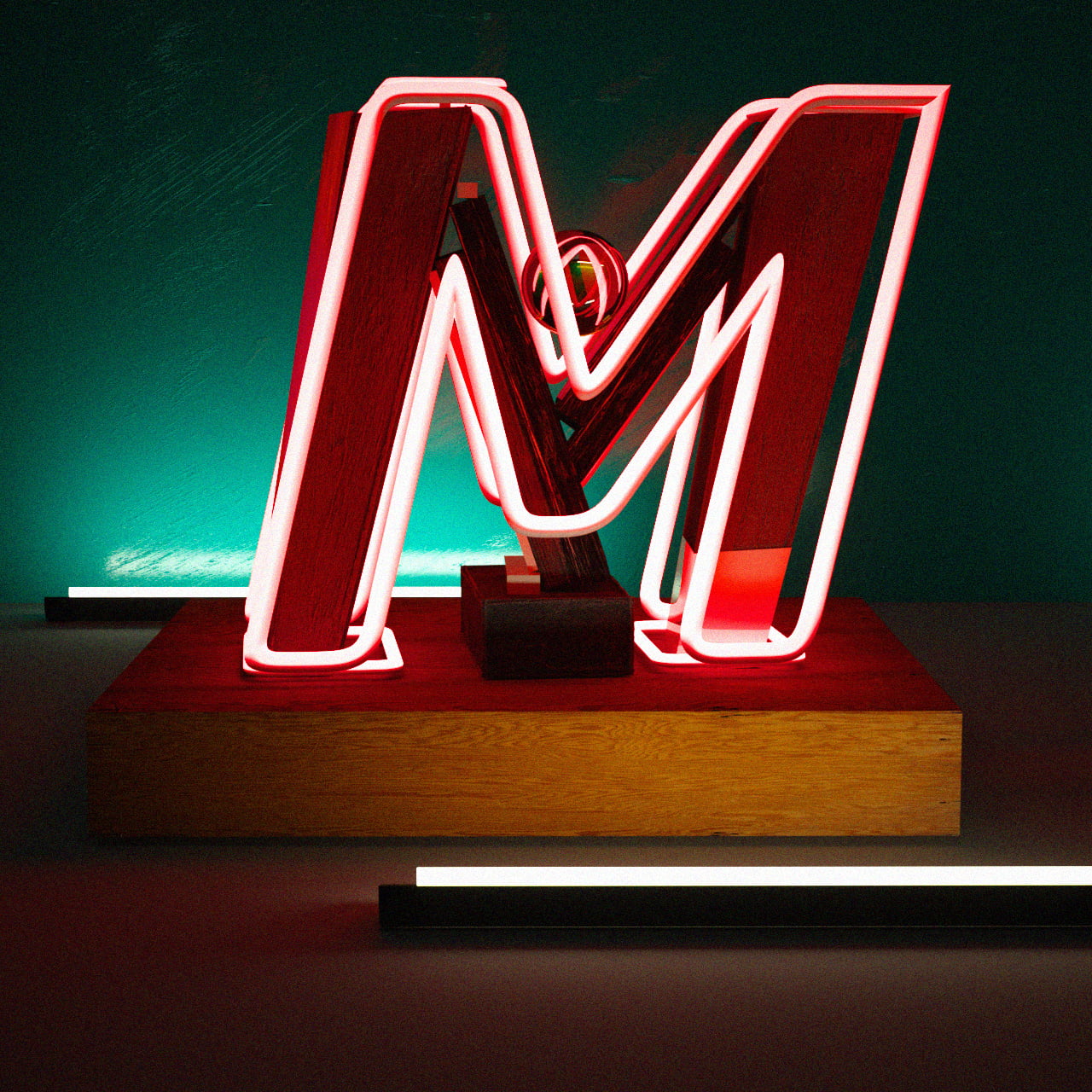
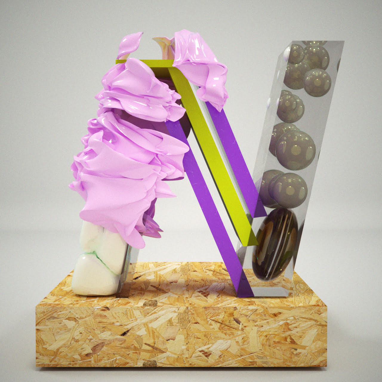
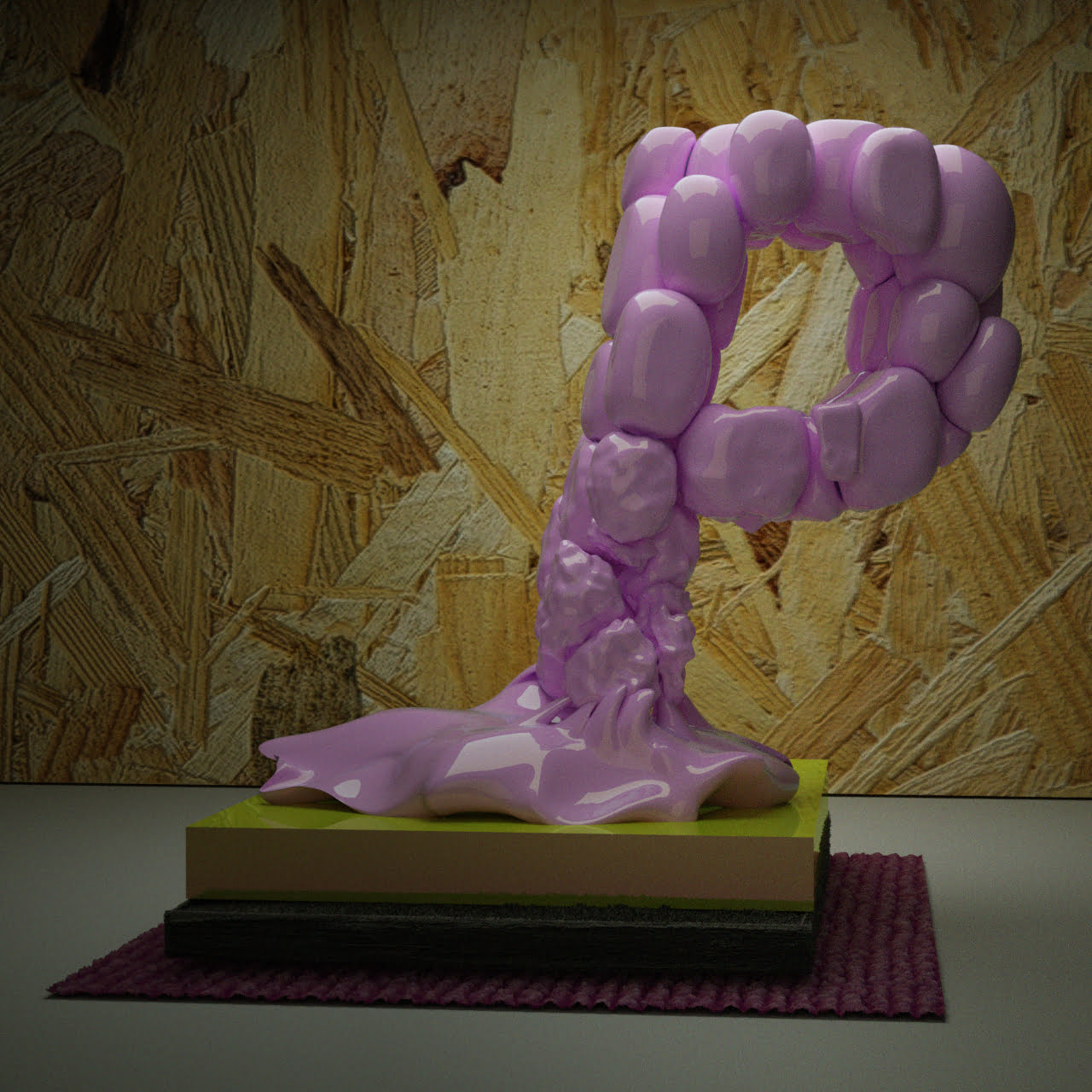
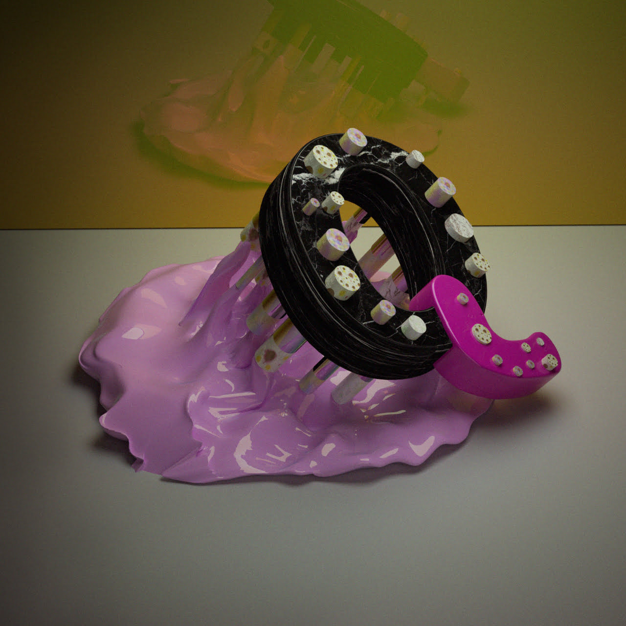
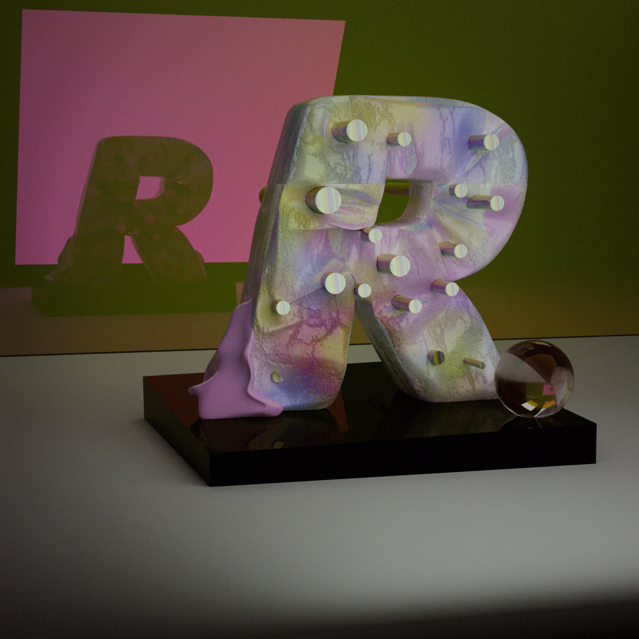
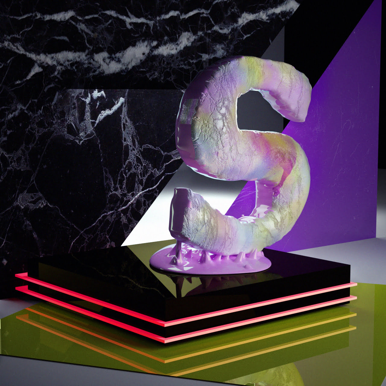
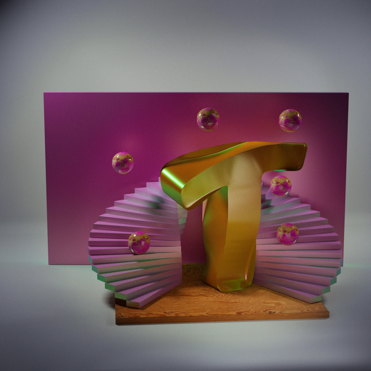
I tried making an animated letter each week, but seeing as I had no set plan for anything, it was hard to decide what to make. An obvious choice was to work with dynamics, seeing as I love the way Cinema4D handles it.
I tried making an animated letter each week, but seeing as I had no set plan for anything, it was hard to decide what to make. An obvious choice was to work with dynamics, seeing as I love the way Cinema4D handles it.
I tried making an animated letter each week, but seeing as I had no set plan for anything, it was hard to decide what to make. An obvious choice was to work with dynamics, seeing as I love the way Cinema4D handles it.
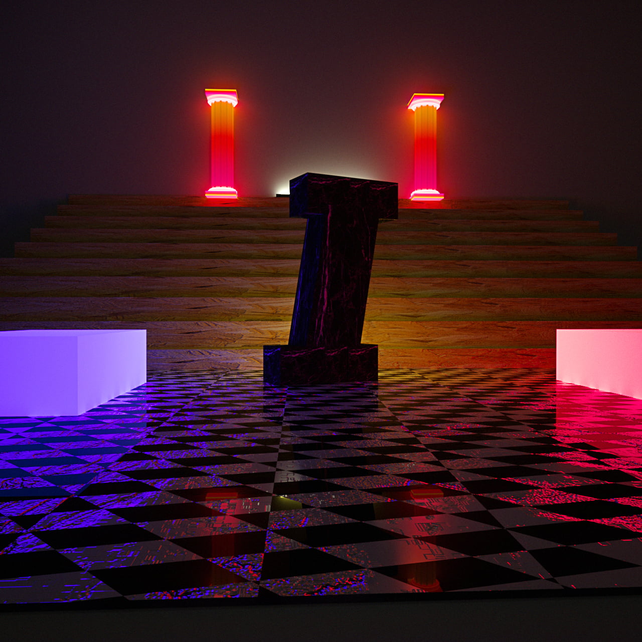
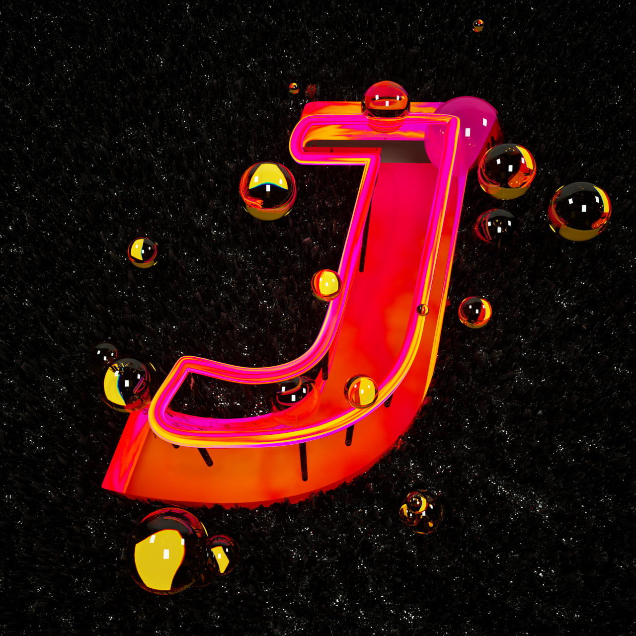
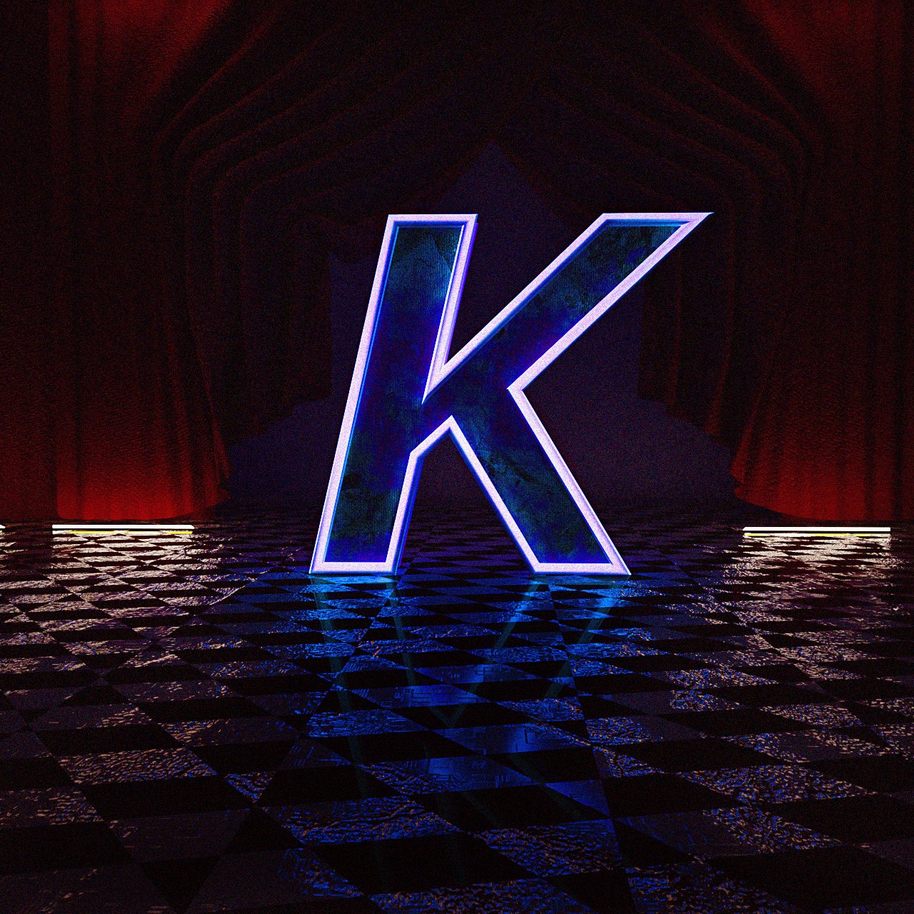
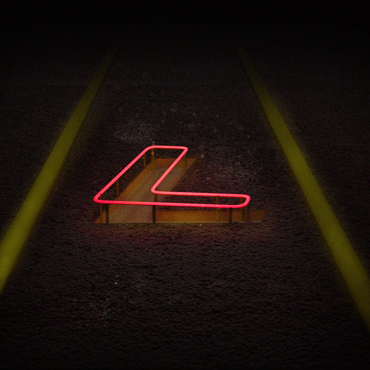
Rather than trying to stick to one theme I tried to come up with different textures, themes and looks per week.

songs of a canary in a coal mine
songs of a canary in a coal mine
songs of a canary in a coal mine
get in touch! yorobi@gmail.com
All content subject to copyright 2022 by Yorobi/Josje Bijl
get in touch! yorobi@gmail.com
All content subject to copyright 2022 by Yorobi/Josje Bijl
get in touch! yorobi@gmail.com
All content subject to copyright 2022 by Yorobi/Josje Bijl